Skip to content
Services
Brand & Creative
Public Relations
Social Media
Inbound / Growth Marketing
Work
dmAI LEARNING
Resources
Blog
Podcast
Free Downloads
2026 Social Media Calendar
About
Our Story
Team / Leadership
How We Work
Contact Us
Services
Brand & Creative
Public Relations
Social Media
Inbound / Growth Marketing
Work
dmAI LEARNING
Resources
Blog
Podcast
Free Downloads
2026 Social Media Calendar
About
Our Story
Team / Leadership
How We Work
Contact Us
Our Work
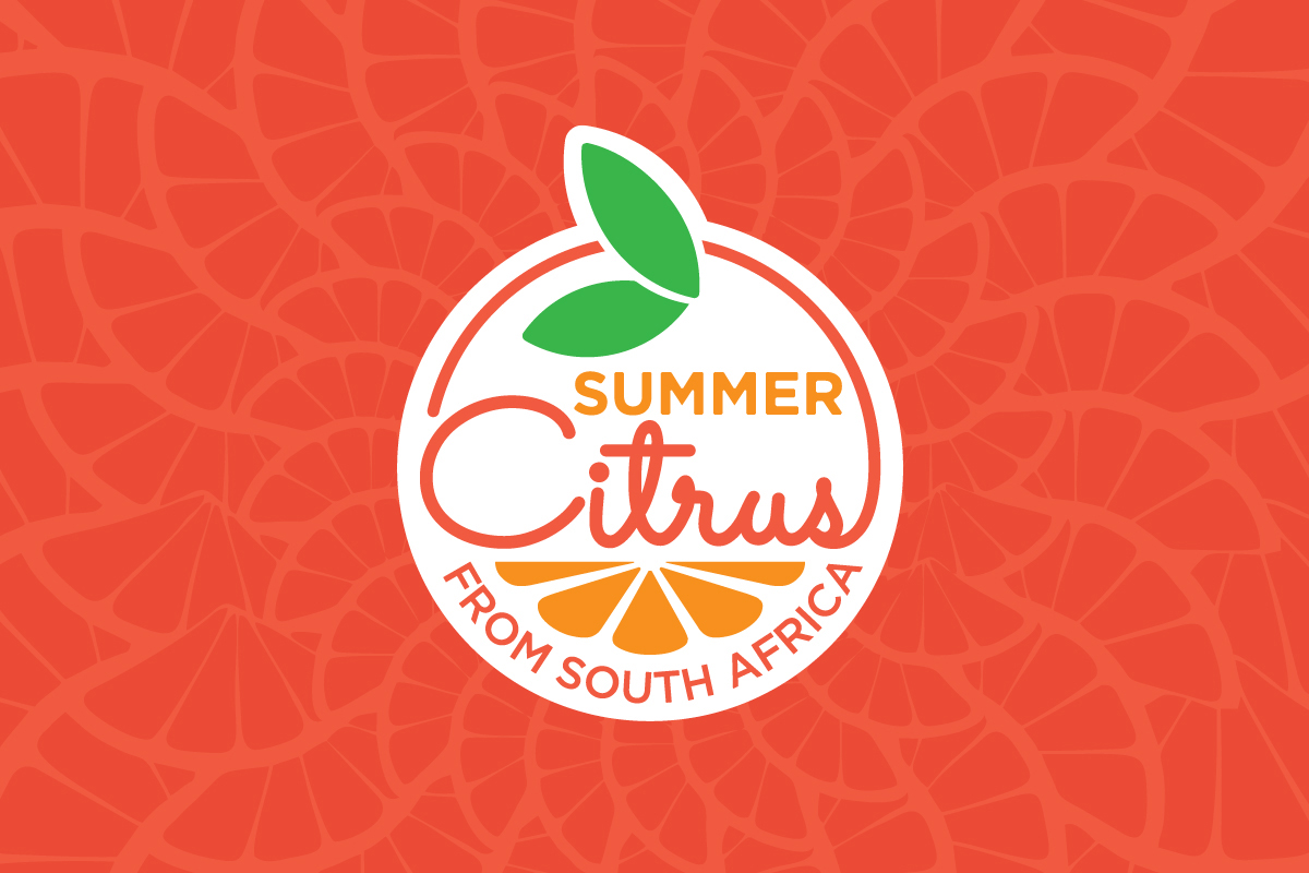
Brand Strategy & Design:
Summer Citrus from South Africa
View Case Study
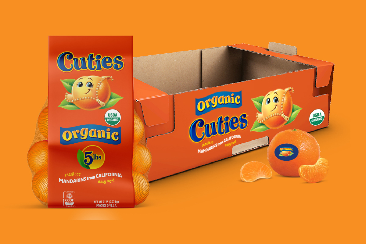
Brand Strategy & Design:
Cuties® Citrus
View Case Study
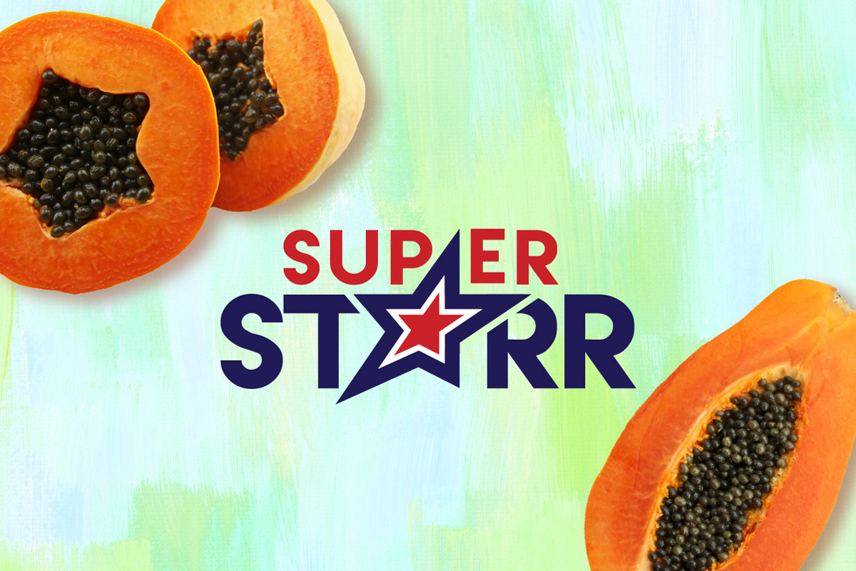
BRAND STRATEGY & DESIGN:
Super Starr
View Case Study
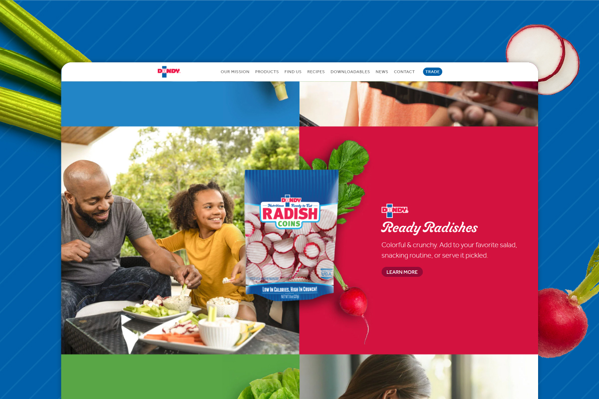
Brand Strategy & Design:
Dandy & Duda Farm Fresh Foods
View Case Study
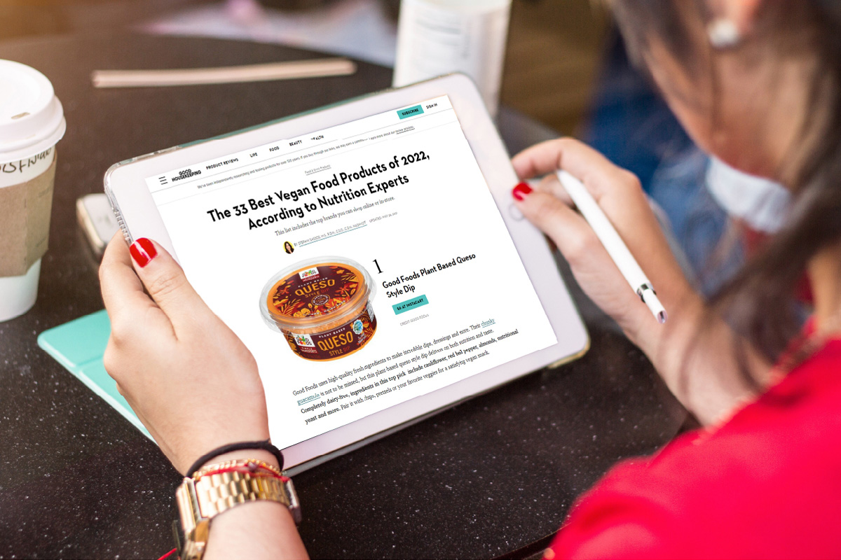
Promotions & Public Relations
Good Foods
View Case Study
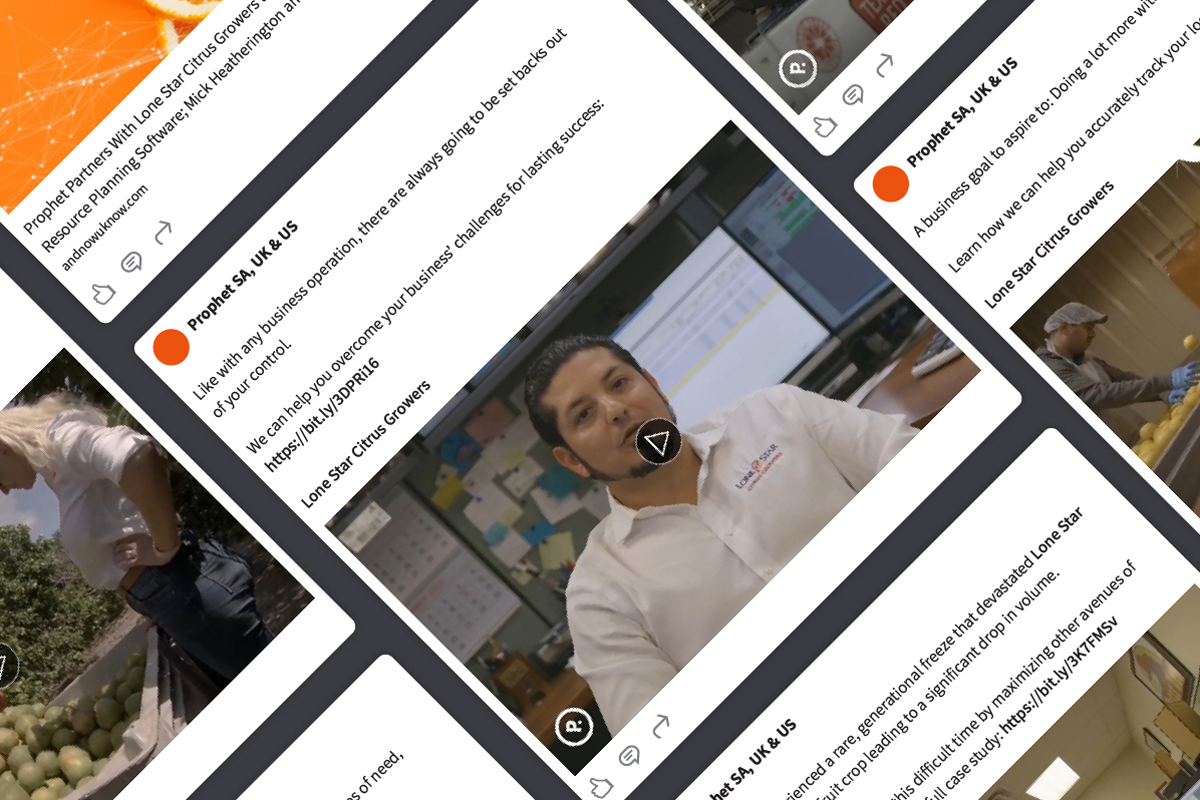
Public Relations & Social Media Marketing
Prophet
View Case Study
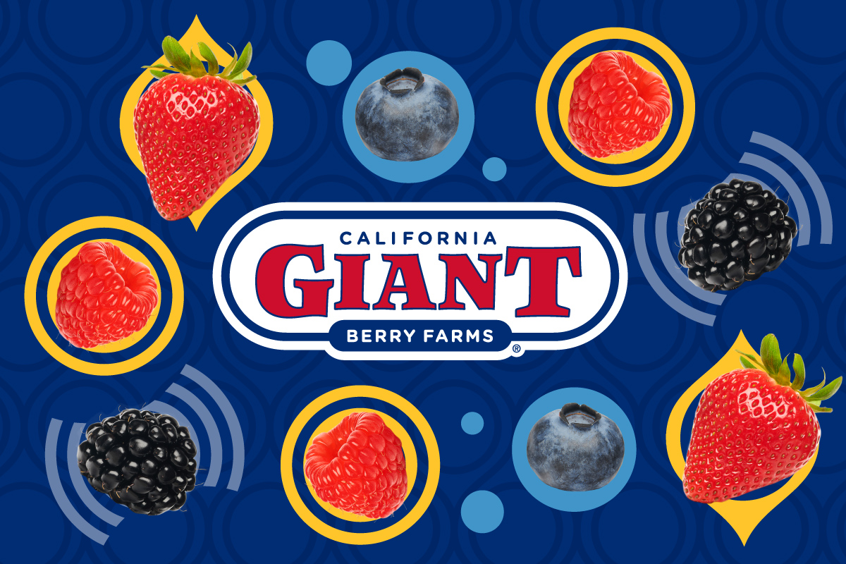
Brand Strategy & Design:
California Giant Berry Farms
View Case Study
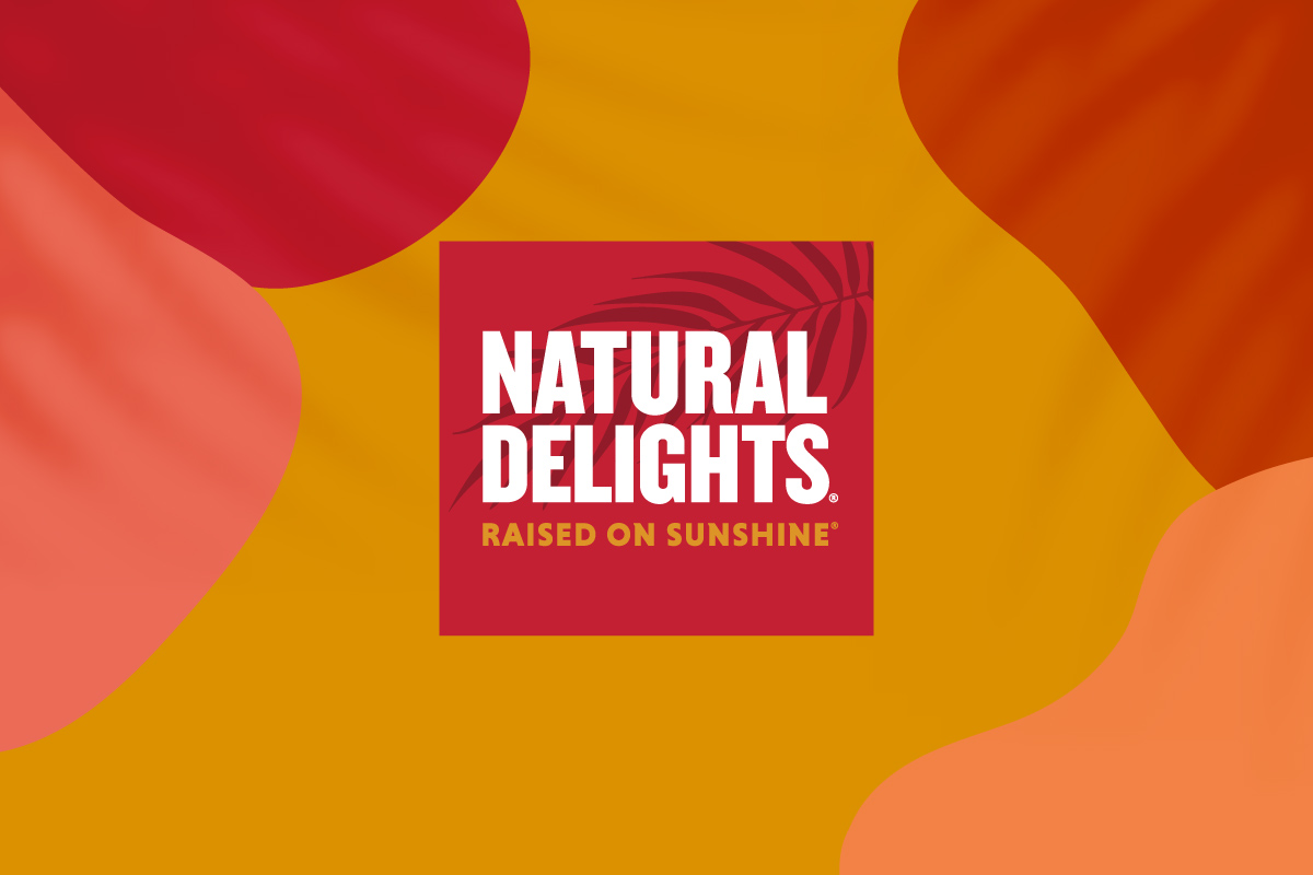
Brand Strategy & Design:
Natural Delights®
View Case Study
Brand Strategy & Design:
Ocean Mist Farms
View Case Study