We are passionate about helping brands build effective digital marketing strategies at DMA, and we love a good website! In this post we rounded up a list of websites we’re loving right now to inspire our team and yours!
Three Websites We Love Right Now
1. Happy Egg
Happy Egg does a great job all around. They set their brand voice, and they followed through with it for every aspect of their website. With a brand that has “happy” in the name, they had to have a little fun – and we love it! 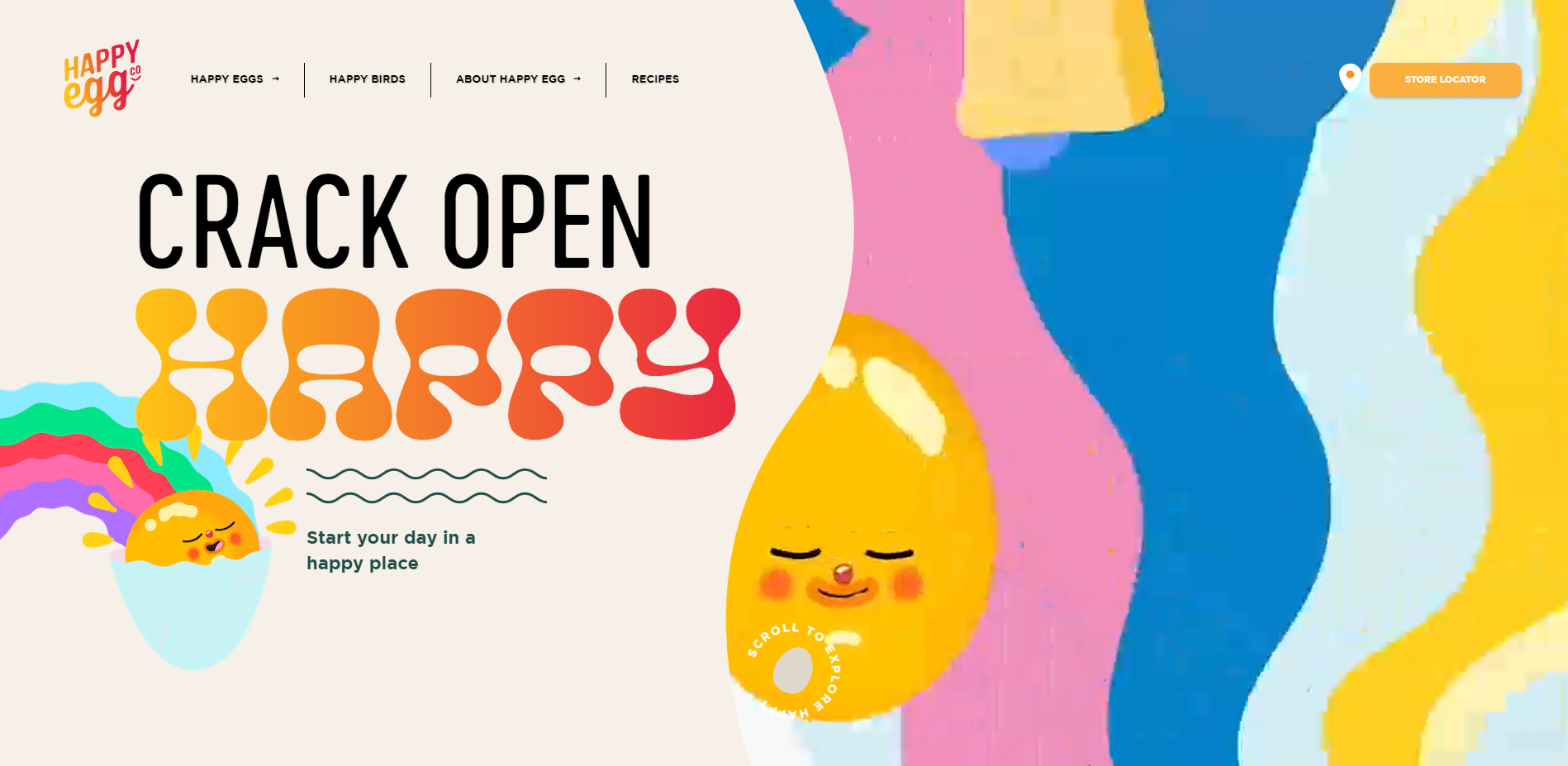
-
Visually pleasing? CHECK. Just look at these fun colors! The mix of static and movement is (*chef’s kiss*) perfection.
-
Interactive? CHECK and CHECK. Collectively, the team at DMA has most likely spent well over an hour just opening and closing these digital egg cartons.
-
Mobile Optimization? CHECK! Happy Egg shows a completely different experience on mobile than on desktop – and that’s how it should be! Huge interactive experiences can slow down a site on mobile, but Happy Egg has found the perfect balance of an interactive mobile site, while still being interactive.
What we can learn from Happy Egg:
Don’t be afraid to have fun! A website can be bold, bright, and interactive – and the visual representation of a brand through a website can be incredibly impactful.
2. Imperfect Foods
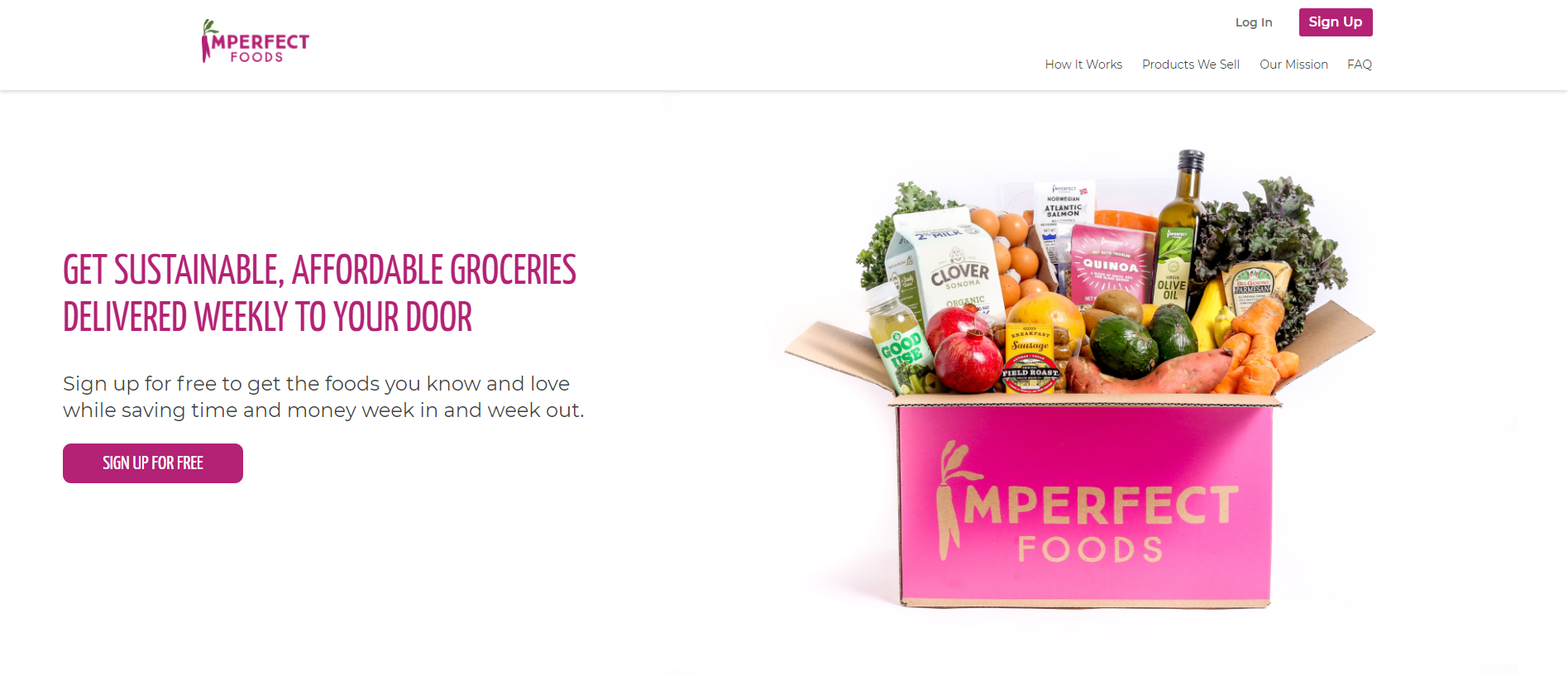
The Imperfect Foods website is clean, simple, and to the point. Frankly, it’s a thing of beauty! Here’s what we love most:
-
Clear Messaging: The messaging on the Imperfect Foods site is definitely not imperfect! Meal kits and grocery kits – even those which are “imperfect” – is a rapidly growing segment. The headline tells the user exactly what the benefits are, and works well with the clean and simple image to the right.
-
Visually Pleasing: We love us some good white space that lets images and design elements breathe a little bit. That little pop of color is done tastefully, and highlights the most important messaging and imagery.
What we can learn from Imperfect Foods:
“Simple” doesn’t have to mean “ugly” or “ineffective.” This is a simple website, but it gives the user what they’re looking for quickly and effectively.
3. Corto Olive Oil Harvest Mini Site
The Corto Olive Oil Harvest Mini Site does a great job of putting the user in the “driver seat,” creating an immersive and memorable experience. Here’s what we love most:
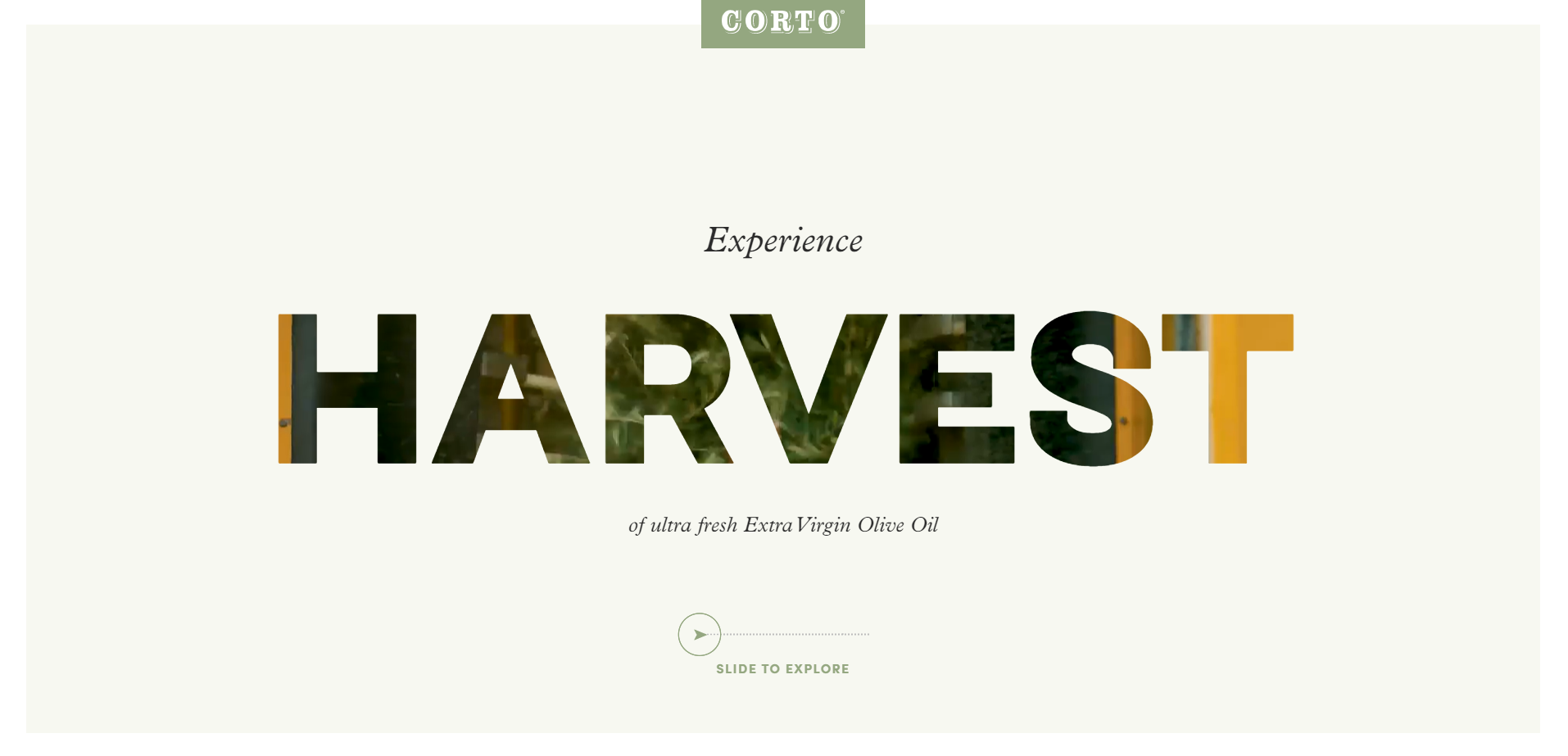
- Interactive: We shed a single tear in awe of the beauty of the “choose your own adventure” style of this UX. We love the full screen videos that don’t feel intrusive, and the intentional, direct actions the user has the chance to explore to get to the next section.
- Visually Pleasing: Brava to the team at Corto Olive Oil for the use of fonts as a design element! The balance of bold and traditional font styles on top of beautiful imagery makes us want to move into these olive groves and live there for a while.
What we can learn from the Corto Olive Oil Harvest Mini Site:
Many fresh produce brands will need a “harvest” section of their own on their website. This website is an example of how to keep that section of sites beautiful and interesting.
So what makes a “good” website anyway?
Great question! We put together a comprehensive list of what makes a good website, and then we turned it into a helpful tool called the Website Scorecard. The Scorecard focuses on how a website measures up according to five distinct categories:
- Messaging
- Functionality and Compatibility
- Analytics
- Design
- Goals and Customer Conversions
Download the Website Scorecard today, then let us know how your site scored!
{{cta(‘c51e313a-a875-4361-bbd3-bea78a505011′,’justifycenter’)}}