 Like fashion, creative design trends change year after year, bringing forward new logo transformations, hip fonts and “it” colors to create opportunities for marketers. Last year it was all about flat design and custom illustrations – so what are the hot 2016 design trends to be on the lookout for? Here’s a few of our favorite upcoming trends to incorporate into your 2016 designs.
- Less is More – We’ve been seeing it for a while. Simplicity first crept back into interior design as modern stylings began to reflect sleek lines and minimal detailing. That same transformation was been playing out in brand refreshes in recent years. Brafton marketing writer, Ben Silverman, shares examples like the Starbucks and Google logo transformation to showcase how brands are creating more simplified and memorable branding that will continue to play out in the coming year.
- Visual Storytelling – By all accounts, visual content will continue to be the king of content in 2016. A quick investigation into the content planned for the March 2016 South By Southwest (SxSW) Interactive conference by Huffington Post writer, Randy Krum, revealed “visual storytelling”, “data visualization” and “visual content” were predominant themes. Four visual formats he highlights as key components of a successful video marketing strategy are animated GIFs, visual presentations, real-time storytelling and infographics. Here’s an example of an infographic we created for The Core!
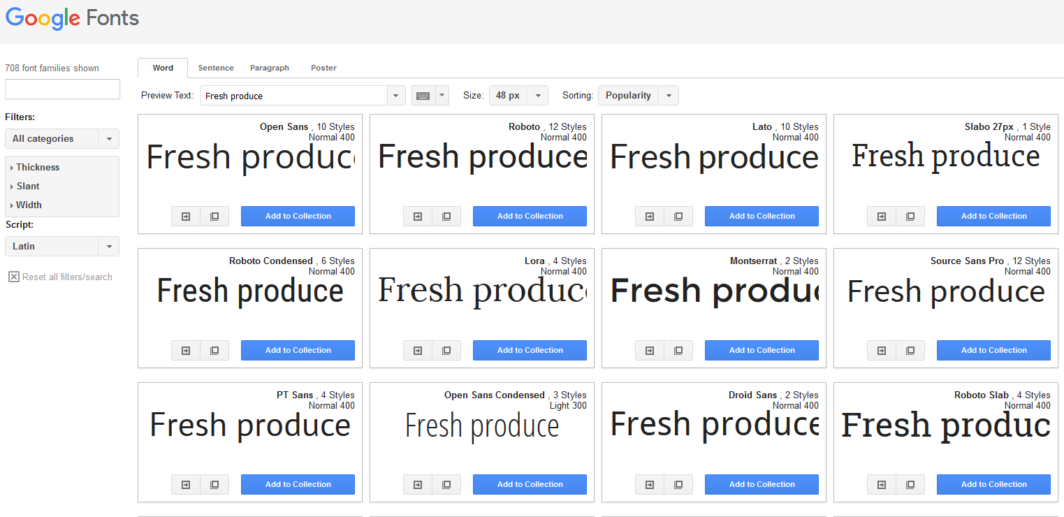
- Font Freedom – No longer are we constrained to a narrow list of standard fonts such as Georgia, Tahoma and Ariel that are deemed ‘web safe’ for their compatibility with common operating systems. Thanks to the Google Font API, web designers have more freedom to utilize creative typography on websites, enhancing the brand’s personality and visual appeal.

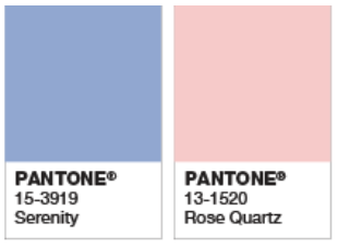
- Color Combination – Pantone has announced that Rose Quartz and Serenity are the colors for 2016 – “a symbolic color selection; a color snapshot of what we see taking place in our culture that
 serves as an expression of a mood and an attitude.” The company goes on to explain, “Rose Quartz is a persuasive yet gentle tone that conveys compassion and a sense of composure. Serenity is weightless and airy, like the expanse of the blue sky above us, bringing feelings of respite and relaxation even in turbulent times.” While brands like Keurig and KitchenAid and Sephora have already begun to offer products in these Pantone colors, it will be interesting to see how this combination makes its way marketing and advertising pieces this year.
Have you noticed any other defining design trends for 2016? Tweet us @TheCoreBlog and let us know your thoughts and stay tuned for more upcoming trends!
