 60 percent of Internet access is made on a mobile device. (Source)
Take a second and read that sentence again.
Being mobile optimized is more important than ever before. Today the decision making process starts online, in business and with personal shopping. If your company’s website isn’t ready to be viewed on every device possible at this moment in time and well into the future, you might as well not have a website at all.
Responsive design is just one of the many ways that your site can be mobile optimized and it is one you should take very seriously. Why? Google’s crawlers won’t even index sites that are not built to be mobile friendly, so if yours isn’t, you can forget moving up in the ranks in Google searches!
So what exactly IS responsive design? As defined by Google, “responsive design” is a web design approach aimed at crafting sites to provide an optimal viewing experience—easy reading and navigation with a minimum of resizing, panning, and scrolling—across a wide range of devices (from mobile phones to desktop computer monitors). Below is an image of a site that has been coded to be “responsive” on any device.
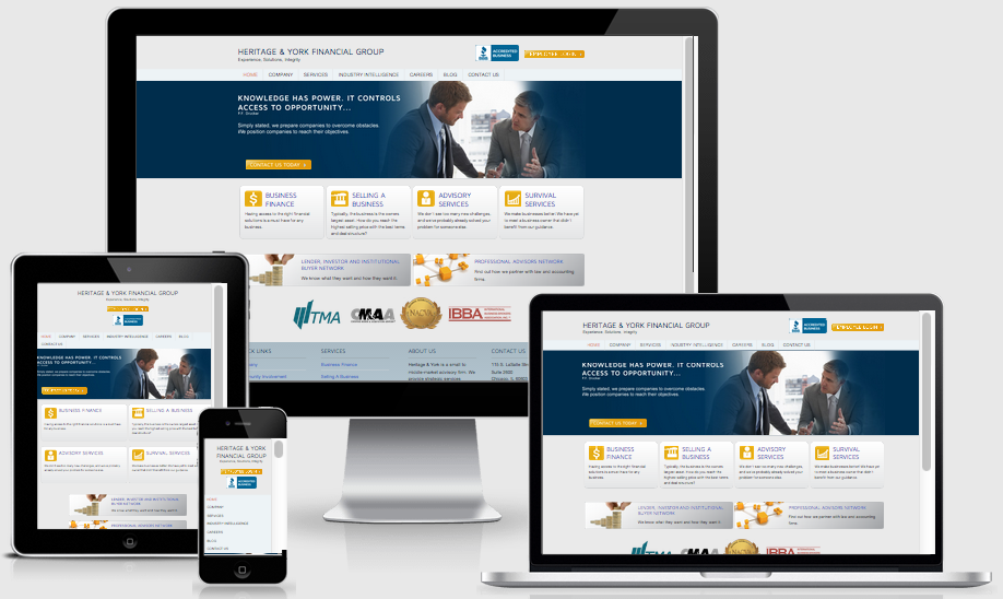
I am sure that you can conclude from the previous picture what the true benefits are for a responsive website design. Having a site that can determine layout by itself based on screen sizes cuts your work in half, thirds, or maybe even fourths and increases your conversion rates as you sleep!
If you can say any of the below statements when viewing your website on a phone or tablet, then you undoubtedly need to consider a responsive redesign in 2015:
- When I view my site on a phone, I need to pinch and zoom to read content.
- My navigation is impossible to read, much less find.
- My site takes too long to load.
- My images are tiny and I need to zoom in to see detail.
- I have poor SEO ranking.
- Viewing my site on my phone or tablet is frustrating and a waste of time. I can’t look at it a second longer!
The BAD news is if you are saying these things about your site, then you can bet your marketing dollar that your audience is too. Trust us; we were in this pickle with The Core. We loved the way it looked, but when we realized that having to zoom in to read our blog on mobile devices was driving away our audience, we knew we had to make some changes.
The GOOD news is that a responsive redesign can alleviate any of the above problems and will keep your audience coming back for more. We’ve already experienced an average 5% decrease in bounce rate year over year since Q3 – Q4 of 2013 with our responsive blog.
Aside from increasing conversions, here is a list of other benefits a responsive website will bring you and your brand:
- It adapts to every device/screen size.
Without you having to blink, your site will size, resize, stack and flex based on the device it’s being viewed on.
- It will improve your SEO.
With the level of competition out there, being found for your products is more challenging than ever. With responsive design you will have ONE URL that is easy to update and optimize your content for. A well-built, optimized site for Google’s robots to feed on will only increase your chances for being found for your top keywords (i.e. apples, gala apples, red apples,etc.)
- It’s easy to maintain.
You won’t need to create multiple versions of your site for a desktop, tablet and mobile phone. As such, any updates to your site will only need to be made once saving you time and money.
- Responsive design will keep your website relevant longer.
- Having a website that is flexible across all platforms and devices not only will make your brand stand out amongst your competitors who haven’t adopted this principle yet, but it will also give it longevity as technology and coding standards advance.
- It’s affordable.
Now that responsive web design is an established design trend, it has been universally adopted and accepted. Just with anything else in technology, the more common a trend becomes, the more competitive the pricing. Having a responsive website used to be a large added cost to any website budget, but for the most part these days, the functionality is included in well-known CMS platforms such as WordPress, WP Engine and HubSpot, to name a few.
My hope is that you’ve already considered building (or rebuilding) your website to be responsive in the new year prior to reading this article. If not, you now have the ammunition you need to go to the decision makers that be and plead your case why your website needs to be responsive if you want to reach your marketing goals in 2015.
Interested in talking more about responsive design with DMA? Email me at mmcgrath@dma-solutions.com.


